Creating effective visuals for email campaigns

According to a study by Veroemail campaigns with visuals had a 42% higher click through rate compared to campaigns without images. However, including images is not the be-all-end-all, it is also about creating effective images that call out to your audience!
Contents
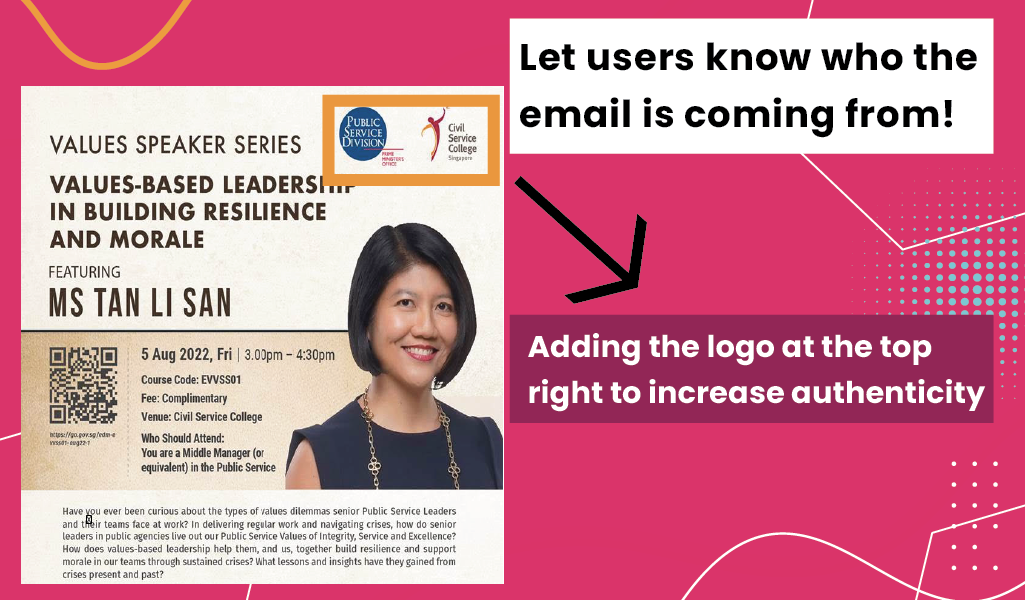
Include your Agency Logo: A 2020 study by Red Sift and Entrust found that logos positively increased brand recall by 18%, and purchase likelihood by 34%. The placement of your logo would depend on the intention of your email. For example, if you would like to improve your credibility and make the email feel more authentic to users, you can place it on the top right corner.
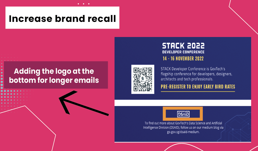
Similarly if you are sending out a longer email, you can place your logo at the bottom right to remind your users about the agency they are interacting with. This will improve your engagement rate. 
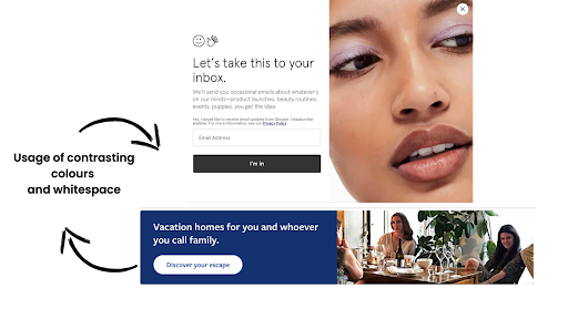
2. Make your call-to-action (CTA) prominent: To make your call-to-action effective , you should make it highly visible. This can be done through using contrasting colours and providing whitespace around your button, so that it is easily clickable. Your CTAs could be part of a larger image (in your header for example) or be created separately via buttons or hyperlinks.
If you’re using multiple CTAs, consider using different colour combinations. For example  use your brand colour with white text for the primary CTA and a grey background for the secondary CTAs.
Source: EmailOctopus
3. Pick the optimal email layout: The layout of your email should help your recipients consume the content of your message with ease and in the right order. For example:

a) One Column

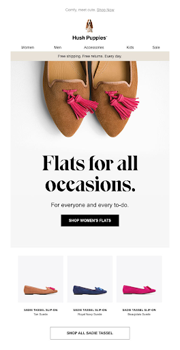
In a one-column layout all your email content is placed within a single column, one after another. This is a simple and mobile-friendly design which ensures that all your information will be shown easily. Furthermore it is also great for focusing your audiences’ attention in the places you want them to look at.
b) Zig- Zag

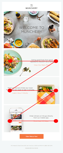
Zig-Zag takes your viewers’ eyes from one side of the screen to the other back and forth as you scroll down the message. It can be an engaging layout that looks good if you’re showing off your products then following them with a description and a CTA leading to your product page for citizens to look at.

Image Source: EmailOctopus

c) Inverted Pyramid

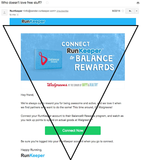
In this layout, the entire email builds towards a call-to-action. By the time the reader gets there, they would be highly eager to click. By placing your wider or larger content (usually the header or a banner) at the top and the slimmer content at the bottom (your call-to-action), your users’ eyes are automatically taken to the place directly tied to your CTA.
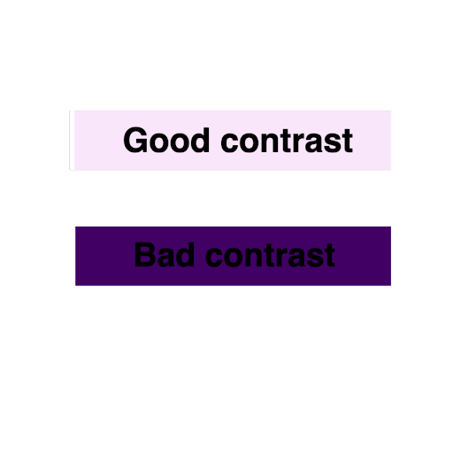
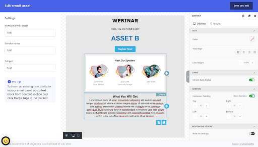
 

Image source: Vero
See more layout examples here
4. Make your visuals accessible: It is highly recommended to ensure your campaign is digitally accessible for people with disabilities and impairments. Make use of contrasting colours between your backgrounds, images and text. Low contrast text is known to be the highest cause for accessibility failures! Your design system communicates your UI and UX practices and it is a good place to encode knowledge about acceptable colour pairings based onWeb Content Accessibility Guidelines’ contrast ratio of 4:5:1
5) Align visuals with your own branding: Use visuals that are more identifiable to your agency and be consistent with your design elements (composition, typography, colour palette, etc). This form consistency creates a visual identity for your agency which creates an emotional impression on your users and connects with them better. Try using more images that are real and fewer stock images!
6) Optimise Spacing and Padding: Ensure that your campaigns have enough whitespace (negative space) to ensure there are ample differentiating points to make reading and clicking your emails easier. Essentially, to allow for ‘breathing space’. According to Get Response, the ideal padding ratio for left and right side would be 20-30 px and for top and bottom it would be 10-20 px. 
Did you know that you can customise your padding and spacing settings on Percy? Try it here!
7) Use the right text-to-image ratio: Images are used primarily to illustrate the text content and are not the main focus of the email. According to Mailchimp, a good ratio would be 80% text, 20% visual to ensure faster load times for users.
Source: hustler Marketing
Use these tips for your next email campaign here